In digital designs, user experience has now started to determine the entire structure of the industry. Especially in search engine optimization, this structure allows users to interact more comfortably and securely within the site. The importance of colors in web design is significant at this point. It has been scientifically proven that the colors used have a major impact on the human mind. Each color represents a different meaning. When preferring one color over another, it is essential to make the change with an understanding of what message we want to convey. As an Eskişehir web agency, we carefully manage all of our web design services, creating site and color modeling that matches the services and structure offered by our clients.
How Are the Importance of Colors in Web Design Determined?
The importance of colors in web design can be determined based on the purpose of the site, the targeted audience, and the color base that reflects its corporate identity. Knowing where and how to use colors is very important. Understanding the meanings of colors, how the chosen colors affect the design, and how the color scheme strengthens the message we want to convey always provides us an advantage in web design.
The Meaning of Colors in Digital Design
One of the most important aspects related to the meaning of colors is that they do not have a universal, concrete meaning. In the digital realm, color alone is not a meaningful element. The cultural significance that we attribute to a color gives it value and meaning within society.
Although there is generally a color symbolism, the meanings attributed to colors can vary not only across different cultures but sometimes even within the same culture. This is because one person may be influenced by the same color differently from another person. However, it is important to remember that the perception of colors differs mostly due to the cultural context in which one is situated.
For example, it is completely natural that a person living in İzmir might feel differently when looking at the color blue compared to someone living in Trabzon. As Eskişehir Web Design agencies, we also consider the cultural meaning of colors in the work we do and design accordingly.
Effects of Colors in Web Design
The effects of colors in web design are just as important as site design, visual selection, and infrastructure choices. Because when a visitor enters any website, they typically examine the site’s visual appeal for about 1.5 to 3 seconds. If the color structure, visual optimization, and headlines appeal to the user, the visitor will leave a positive reference for the site. This, in turn, affects the likelihood of the site being visited again and the reactions of users.
What Do Colors Represent?
One of the things to pay attention to when doing web design is undoubtedly the meanings of the colors. Each color carries a different meaning and can be appropriate with a different color. The meanings of the colors used in design are:

Warm Colors in Web Design
Warm colors include yellow, orange, brown, yellow-green, and orange-red. These colors are associated with enthusiasm and excitement. They create a good impact when used in small amounts.
Yellow: Known as the color of the sun. Bright yellow is a striking color, but if used excessively, it can be distracting. It is associated with joy, happiness, and wisdom. Yellow has a warming effect and generally evokes pleasant feelings. However, the soothing effect is less prominent with pale shades of yellow.
Orange: A mixture of red and yellow. Orange doesn’t appear as aggressive as red and is generally associated with healthy foods. It is a color linked to joy, sunlight, enthusiasm, happiness, creativity, success, courage, and strength. It has an appetite-stimulating effect. It often reminds people of autumn and harvest time.
Brown: The color of the earth and is typically a color that tends to stay in the background. It is associated with order, stability, and tradition. Brown gives a sense of solidity and wholeness.
Red: Known as the color of fire and blood. It carries intense emotions. It is associated with energy, war, strength, danger, determination, self-confidence, courage, passion, desire, and love. Red has properties that accelerate metabolism and respiration and increase blood pressure. Red is always a color that stands out. It is often used in buttons because of its ability to motivate people.

Cool colors include blue, green, and purple. These colors have a calming and soothing effect and are commonly used.
Blue: Known as the color of the sky and the sea. As the opposite of red, it slows down metabolism, respiration, and heart rate. Blue is typically associated with trust, loyalty, experience, intelligence, self-confidence, and stability. It is considered a calming color, thought to suppress appetite, and beneficial to both the body and mind. For this reason, blue is often used in corporate websites.
Green: The color of nature, symbolizing growth, hope, freshness, and abundance. Green is generally associated with healing, stability, resilience, safety, prosperity, and life. In advertisements, green is used to convey the reliability of medicines and medical products.
Purple: A mixture of blue and red. It evokes a sense of luxury and extravagance. Known as the color of nobility, purple is generally associated with dignity, virtue, creativity, independence, mystery, and magic. Light purple is considered feminine. Since purple is rare in nature, some associate it with artificiality.

Neutral colors include white, black, gray, and colors predominantly made up of gray tones. Neutral colors are generally used in backgrounds and to enhance the effects of warm colors.
White: A color associated with goodness, innocence, and purity. It generally evokes positive associations and is seen as a color that conveys trust.
Black: Associated with power, elegance, formality, death, and evil. It evokes feelings of power and authority, triggering emotions of fear and the unknown.
Gray: The color of sorrow and separation. It is associated with responsibility, safety, maturity, and reliability. People who prefer gray are often characterized as loners or narrow-minded.
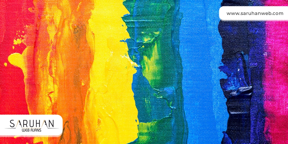
Multicolored websites are among the sites where visitors spend the least amount of time. This is because the combination of warm and cool colors is often off-putting to visitors. These sites are usually complex. In such cases, you should select a pair of colors and stick to them throughout the design. If you need professional assistance on this, you can get support from our professional team at Eskişehir Social Media Agency.
Other Factors in Web Design
Color Harmony: Using too many colors can cause discomfort and lead to complexity. However, using too few colors can create a dull appearance. The best choice is to achieve balance by using a few different colors on a page. Additionally, warm and cool colors should be used in a way that does not cause discomfort.
Computer Color Display: Computer monitors display colors using RGB color values. RGB stands for Red, Green, and Blue, which are the primary colors used in this system. RGB is a mixture of these colors. When red, green, and blue light are mixed in equal amounts, they create white light. All other colors are displayed on the screen as combinations of RGB values.
Web Colors: One of the most common issues on the internet is that colors do not spread evenly and correctly across websites. This is due to using a color with too much depth, meaning a color that the computer might struggle to display. These issues cause visitors to leave the site quickly. You can solve this issue through color optimization in image editors (like Photoshop or Fireworks).
Text Colors: It is extremely important to choose text and background colors carefully. Legibility must always be maintained. If the text is light-colored, the background should be dark-colored. Black and white are always a good combination. Red and blue are often used to highlight important sections. For text with warm colors, do not use black as a background color, as such text may not attract the visitor's attention.
Colors are much more powerful communication tools than we realize and have a significant impact. The first impression of your website is created through colors. When visitors first enter your site, the memorability and emotions you can convey as they browse are hidden in your site's colors. Eskişehir Web Design Agency is always here to assist you with your website designs.


